UPPER CRUST BAKERY
I wanted to emphasize the french heritage of all the recipes but yet to have a feel of their produce being local and organic.
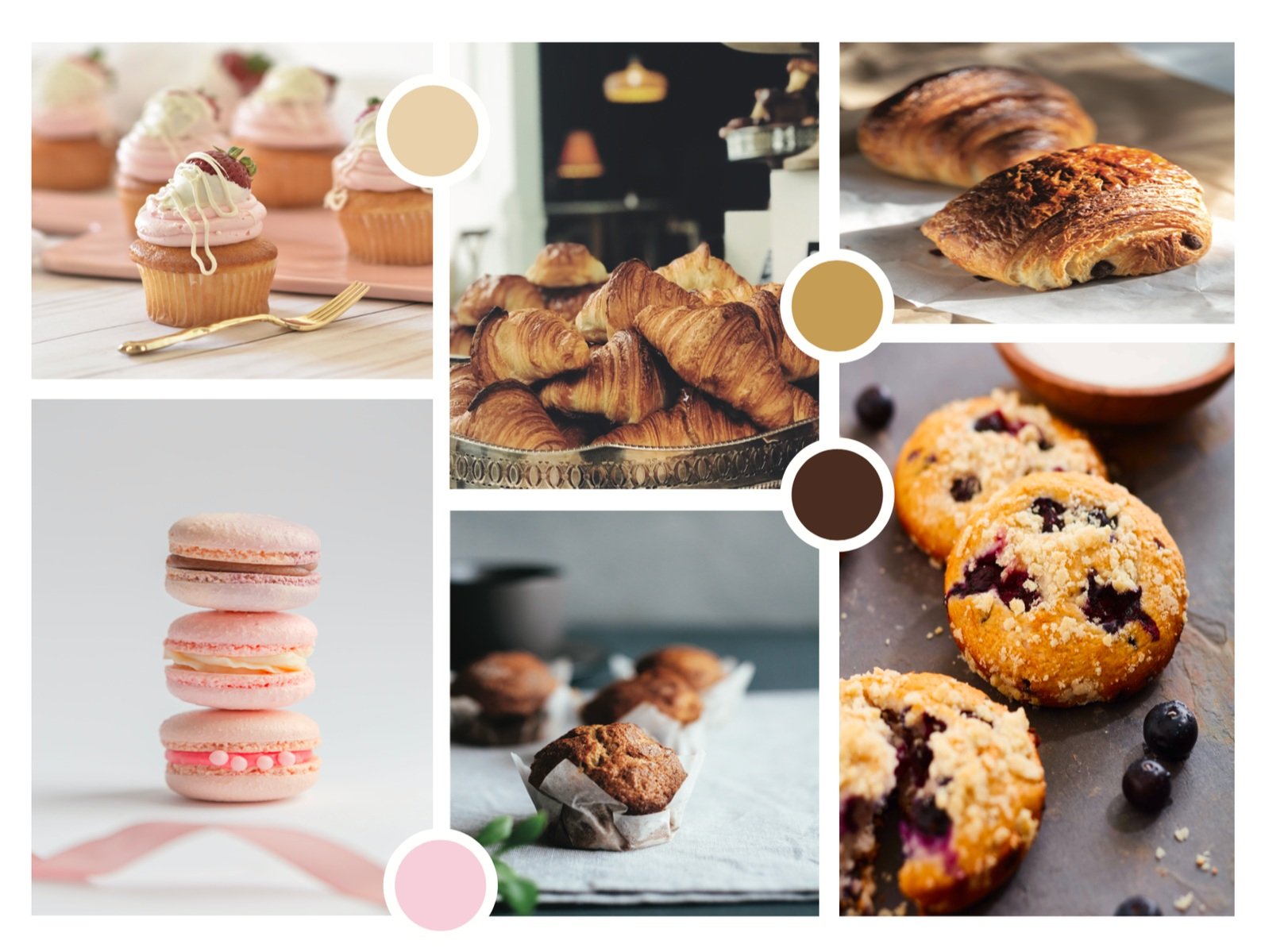
I also wanted people to have a great experience in their space and enjoy the best pastries in town!
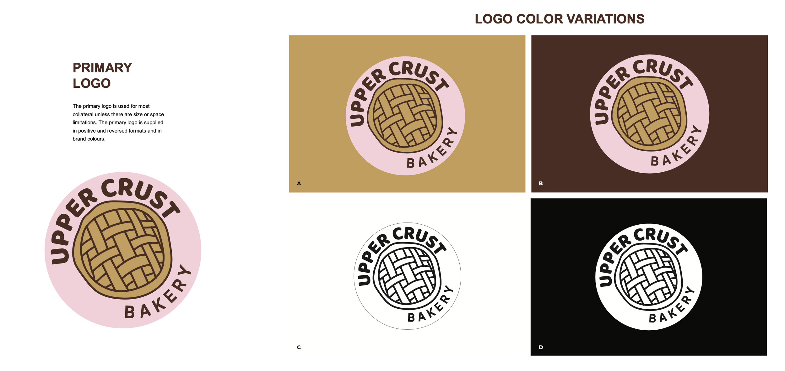
I chose the colors that are common for baked goods, the palette is mostly brown, but decided to add a light pink color for some playful and bright tone of the brand identity. This logo and the brand itself needs to be appealing to a vast range of people in the age from 21 to 65 years old, both men and women.
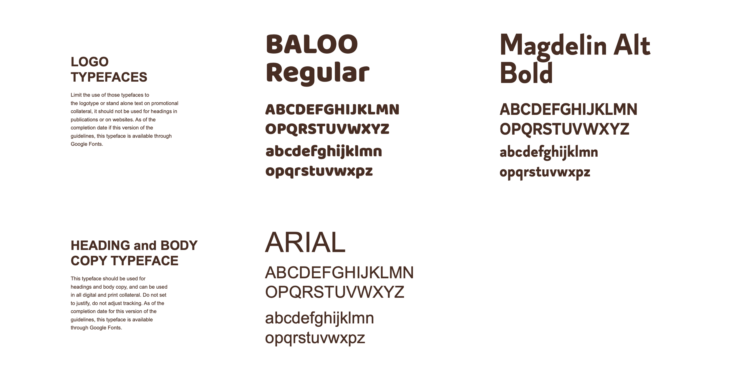
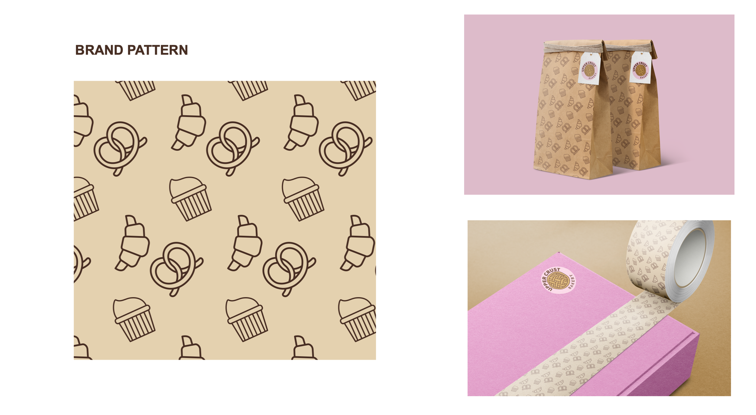
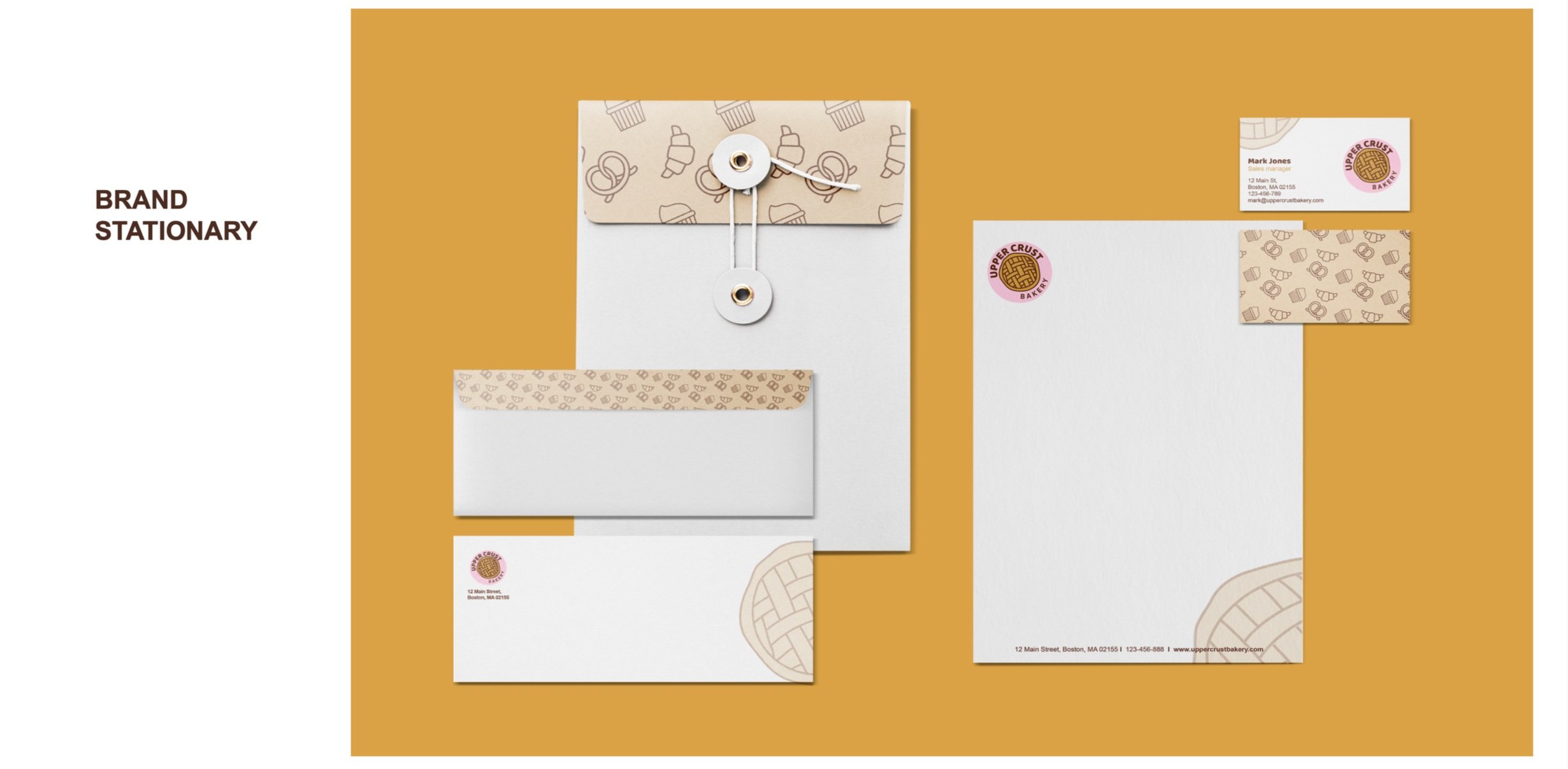
The colors used here supposed to represent the home made recipes and local produce. This logo needed to feel hand made, which meant “made by hands”, special and with love. I decided to use simple and modern fonts to make it less formal. I also created a pattern with each icon symbolizing baker products. This pattern can be used on a craft paper tot packaging.