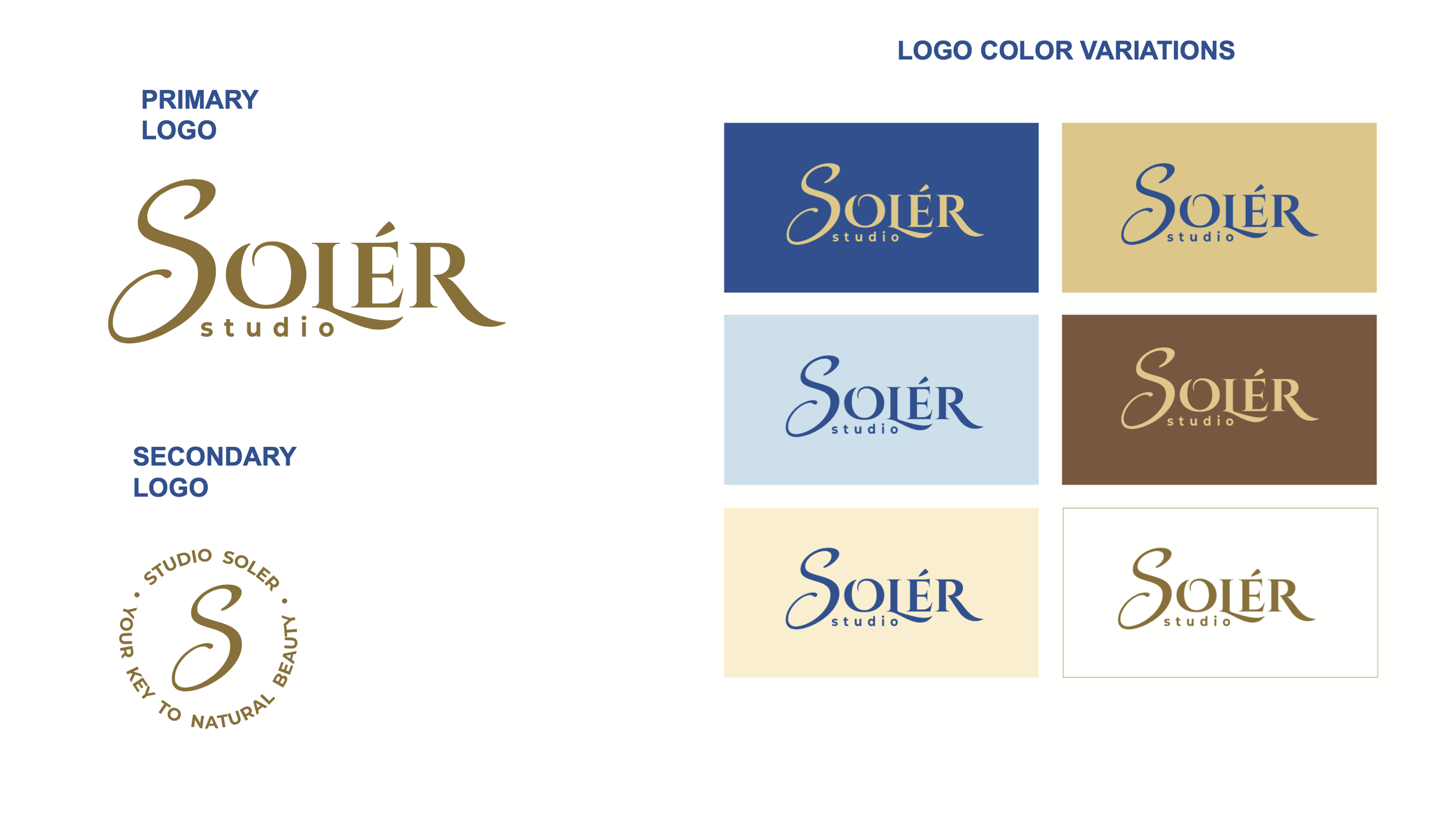
SOLER SPA
Brand identity design
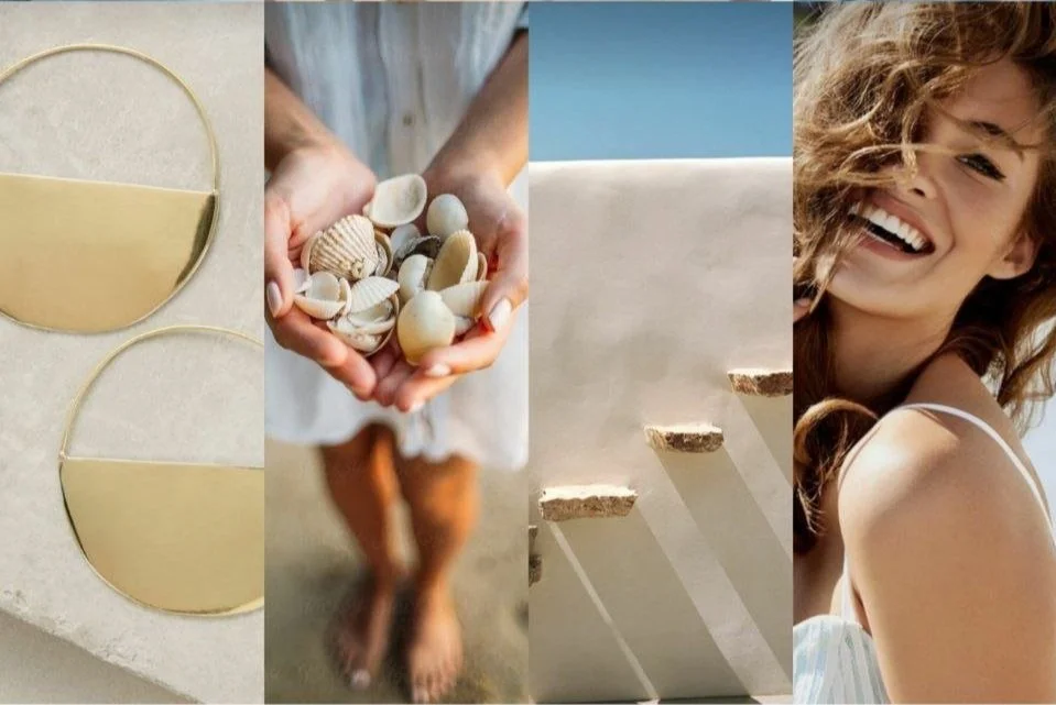
This is a brand identity design for a beauty studio that specialize on face massage and some other natural beauty services. The main idea behind the brand is an association with relaxation and softness of the natural treatments. The color palette used consists of natural warm colors that remind of a sun, sand and a sea water that create relaxing mood and let the clients enjoy not just the massage itself but also the whole studio experience. The brown colors refer to the bronse of the skin and the idea of natural approach of the whole brand.